
Generating response time histograms for PHP
Whilst debugging an issue related to response times on Nomad List and Remote OK, I started to think about what kind of data we have available to analyse.
We keep access logs for all requests coming through the PHP-FPM engine. I briefly wrote about how I use these to find slow PHP scripts. Sorting the results and picking off the top ones like in that post generally works, but I wanted a way to graphically see what kind of response times we're achieving.
I wrote a really small PHP script to parse the PHP access logs and generate data to throw into CanvasJS for displaying. The script is attached at the bottom. It's a little hacky, and ironically enough, quite slow, but it does have to parse 1 million rows.
It uses the Tail PHP library to get the records so be sure to use composer to install that.
It's easy to modify; whether it's the chart styling, number of records to parse or filtering down to one website. I won't walk through how to do this in this post but I'm happy to help you over email.
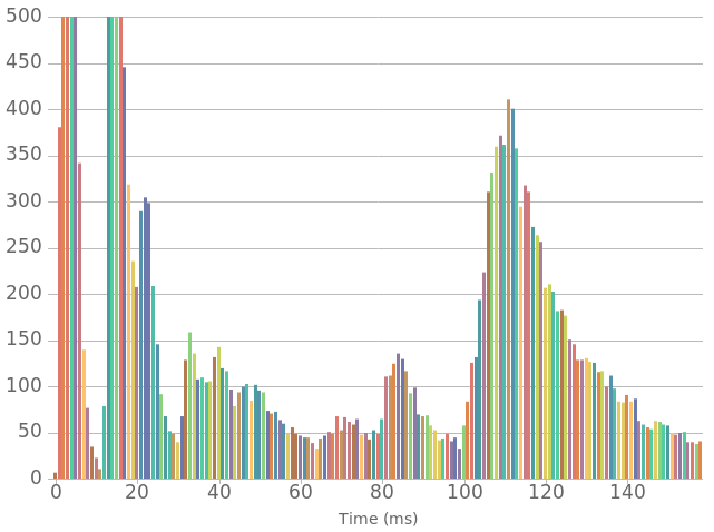
In the image above, I capped the count to 500 just so the super frequent times don't skew the chart. I also cut off the outliers, but it's also important to take a look at these as they indicate some responses are taking a long time. It shows a pretty nice multi-modal distribution and the right-most peak seems to be a really nice Erlang Distribution.
From this data, you can see what range of response times you're returning and their frequency. You can use techniques such as the forementioned bash command for finding slow PHP scripts, Flame Graphs or XDebug profiling, to find out what is going on with your code.
I can help you speed up your website, so email me at hi@daniellockyer.com!