
Project: Cron Heatmap
Towards the end of last year I made Cron Heatmap, a website to visualize your cron jobs and help you find hotspots.
The motivation from the project comes from my work over at Nomad List and Remote OK. There are over 70 cron jobs configured to run throughout the day. Over time, I noticed there would be times of the day that a dozen or so would fire up, and eat a good chunk of CPU. This isn't great, and I would rather they be smoothed out over a period of time.
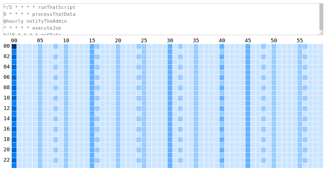
Just by looking at the crontab, it's hard to see which times of the day are particularly "hot". It's probably going to be at the top of the hour, or at midnight if you tend to use @daily but still, it's tough to see the trend.
I came up with the idea of generating a heatmap based upon the data you can pull out from the crontab. I had Brendan Gregg's latency heatmaps in mind so that's sort of what I was aiming for.

Creating the site was pretty straightforward. There are a bunch of JS libraries for parsing crontabs so then I just piped it into d3 to visualize it. I added some statistics such as most frequent times and details about which cronjobs are ran at certain times.
I'm not sure what I'll do with the site yet. There are a few things to fix and improve but it's still a great tool for me right now.
A limitation to the site is that it can't know how long these cron jobs run for so the server may build up with multiple cronjobs over a short period of time, thus creating the same issue. Maybe I could link it together with a cron monitoring solution to produce real-world information.
Also, it ignores cronjobs less frequent than daily. This isn't really an issue though, as we're generally more concerned about day-to-day action.
If you like the tool, feel free to let me know at @DanielLockyer!